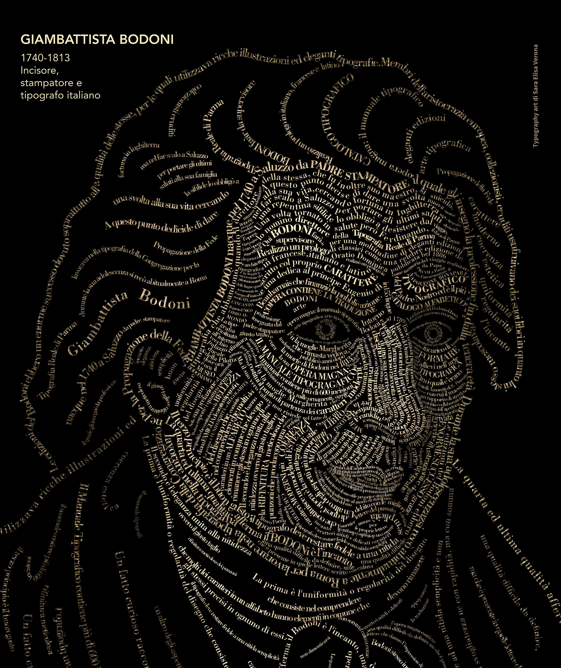
Finished work
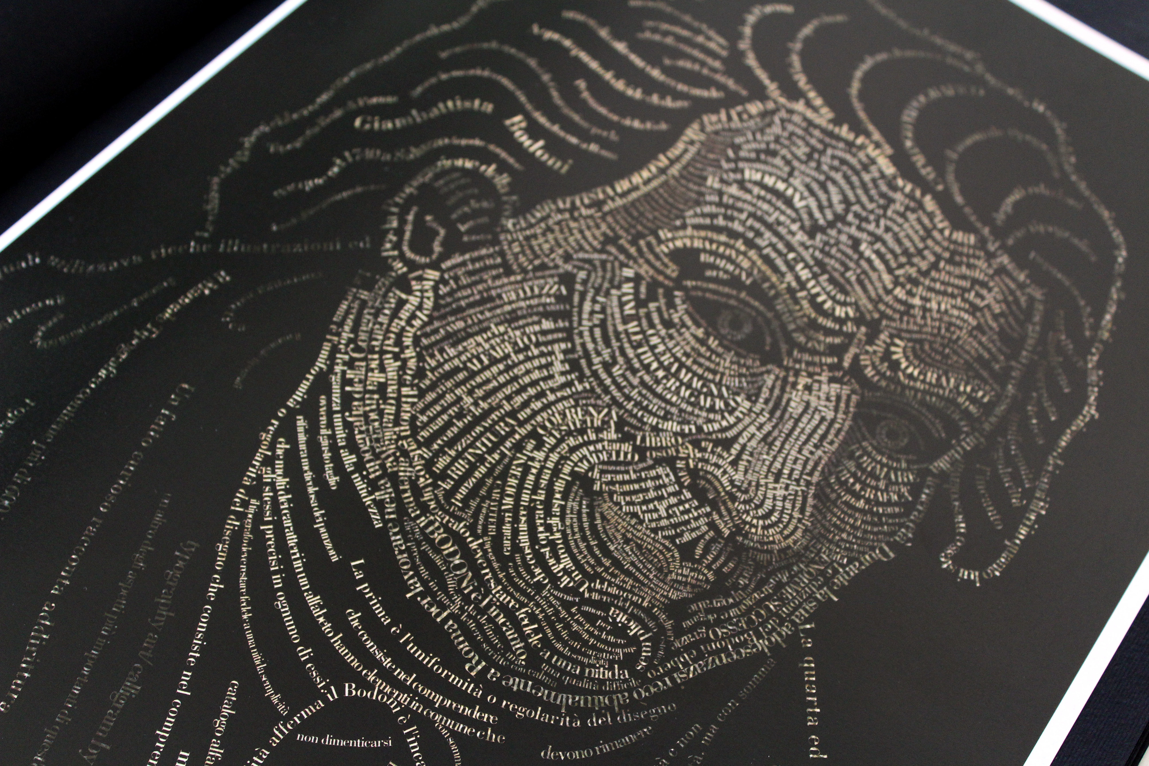
Giambattista Bodoni's typographic portrait in occasion of the 200th anniversary of his death (2013).
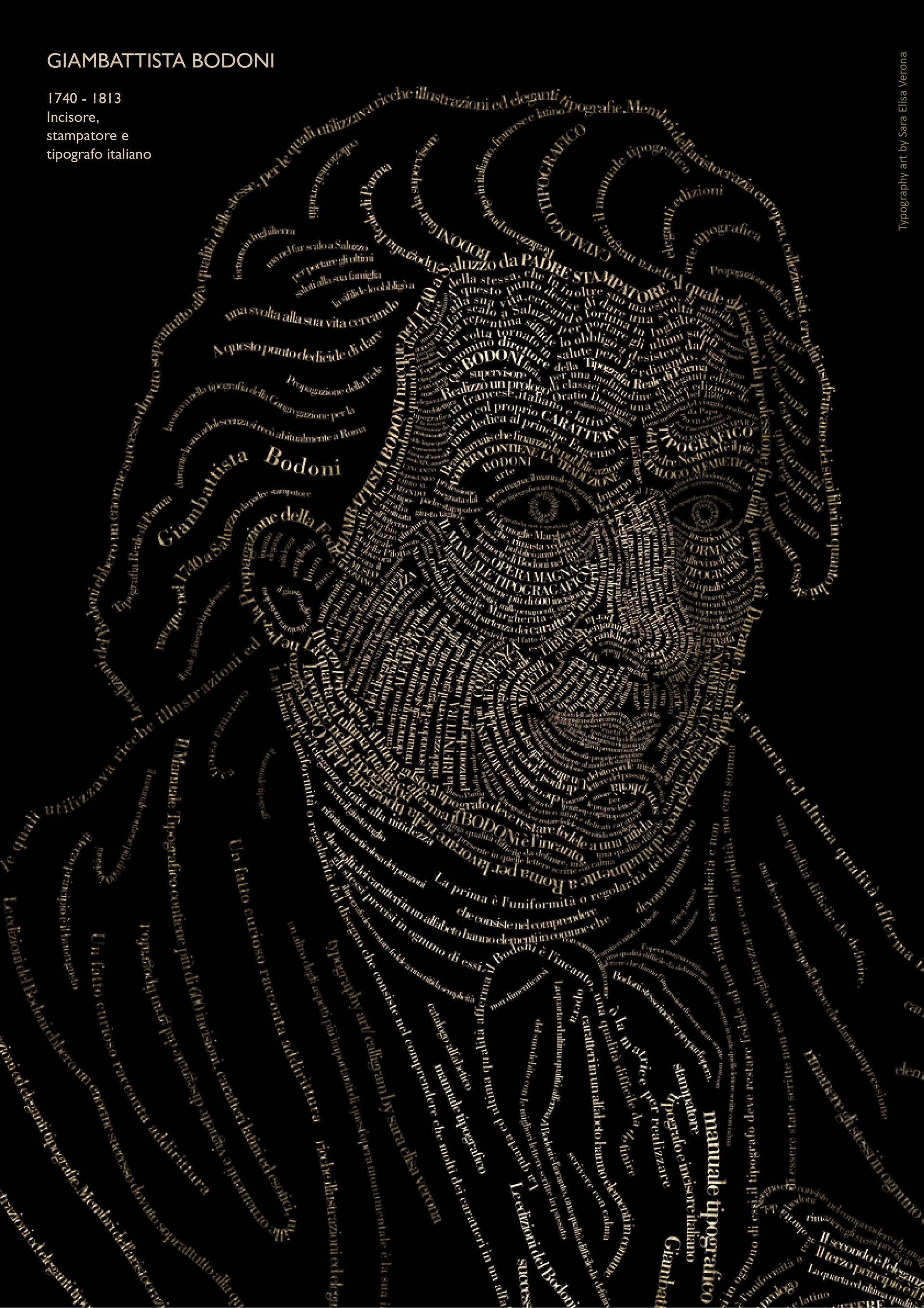
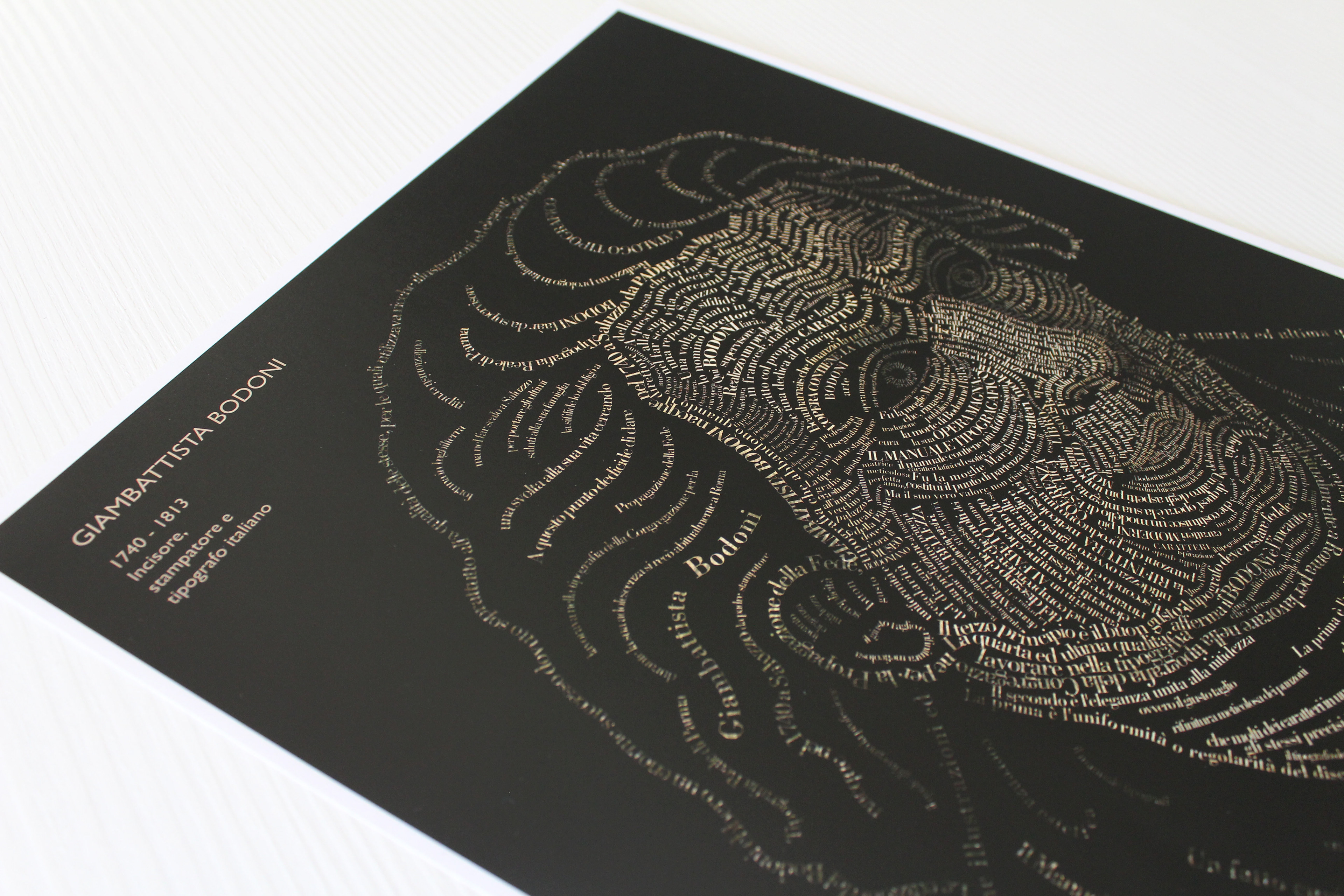
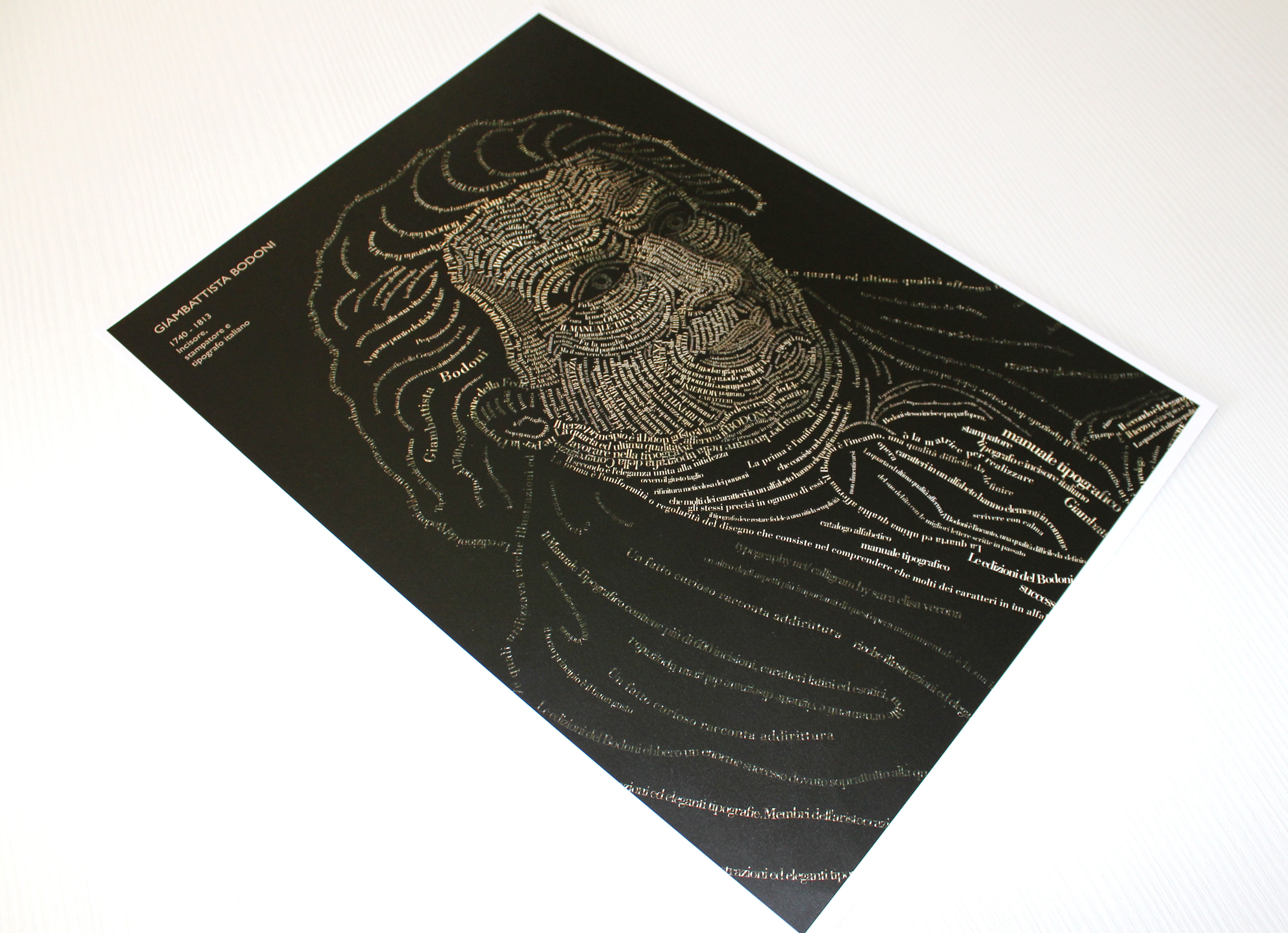
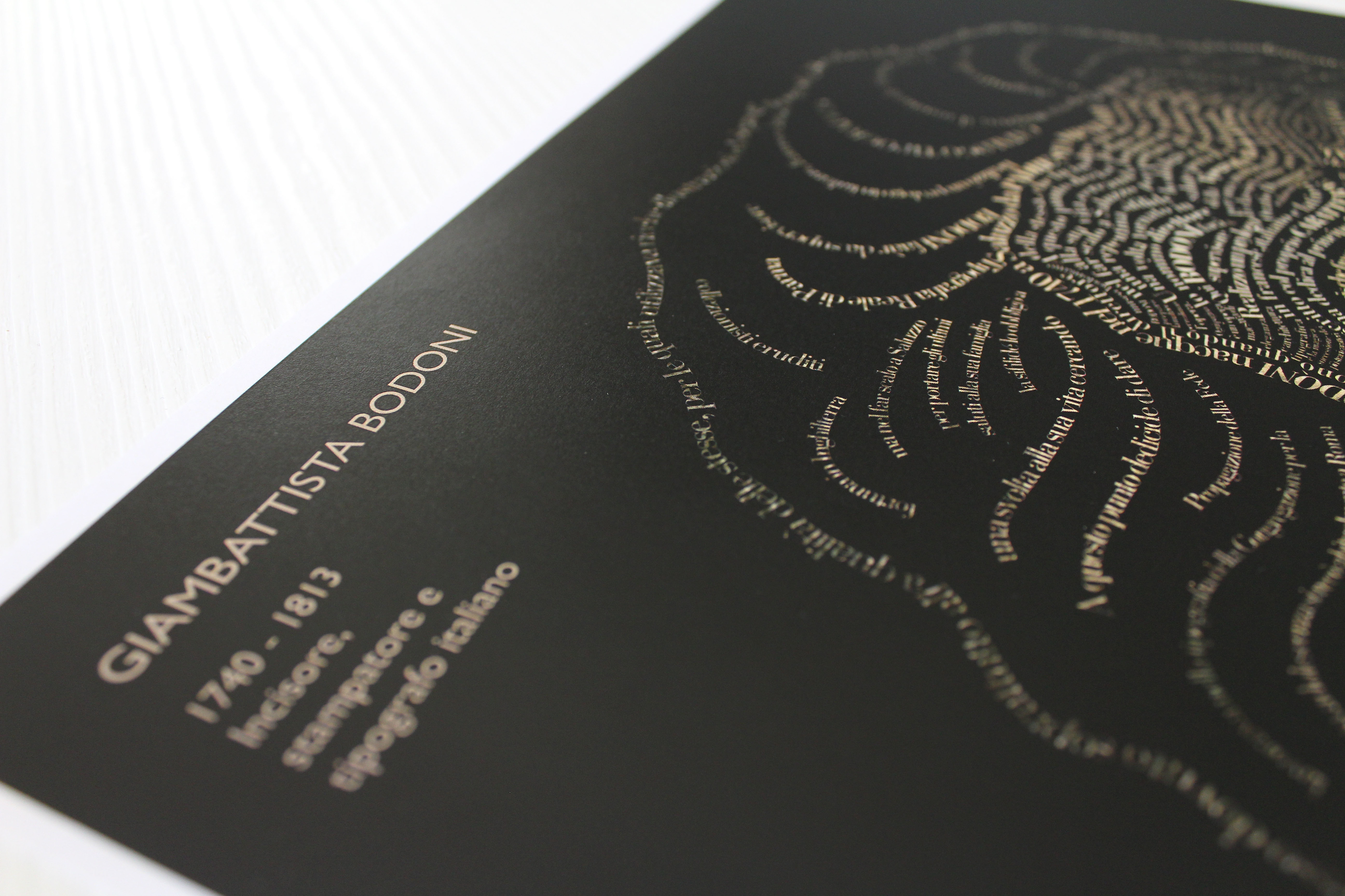
Bodoni (1740-1813): Italian typographer, type-designer and printer.
Typographical portrait / Calligram
Typography art is something I have been fascinated with for a while, especially thanks to Dylan Roscover's works. Ever seen Steve Jobs’ typographical portrait? Or Obama’s? If you did, he is the one behind those fantastic works.
I tried several times to start a project like this with my own face, but always ended in despair not knowing which words or text could represent me or in which areas of my face this text should be positioned.
When it gets personal, it automatically becomes more complicated.
Time passed by and when I volunteered to make an illustration for my school’s annual magazine, typography art came to my mind again and thought it would fit this year’s subject: The Shape of Words.
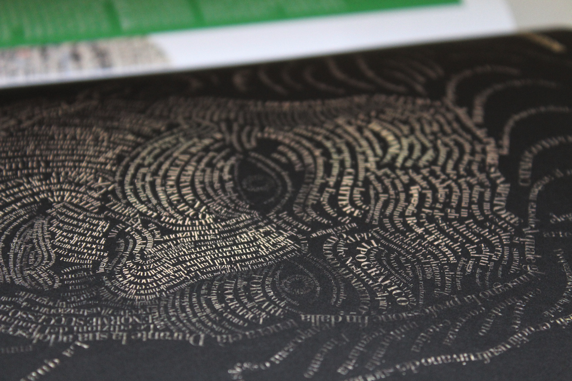
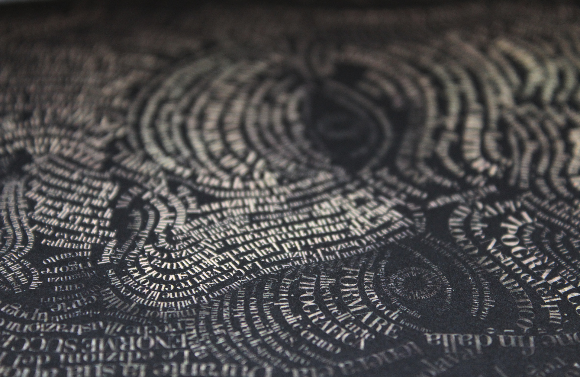
Eventually, after some thinking and consulting, I chose to work on Giambattista Bodoni’s portrait. His biography in Italian is the text I used to shape his face. He is the man who created the Bodoni font and 2013 was the 200th anniversary of his death. So this is also a way to commemorate this great Italian typographer.
As for the process, I must say it was quite a beautiful but time-consuming experience. Patience is indeed a requirement for this kind of endeavors. I used the Bodoni font and never distorted the shape of it to fit the face or the facial expressions. And because of the font’s serif nature, it was difficult to fill all the gaps which resulted in not having a much compact rendition. There is always room for imporvement, nevertheless, I am proud of how it came out.
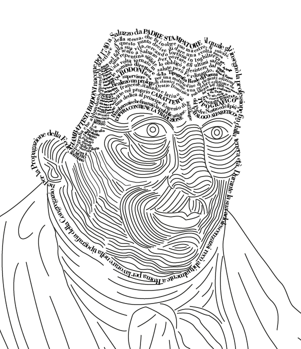
One of the first screenshots of the process: I first traced the facial lines and proceeded to filling them with text, one by one.
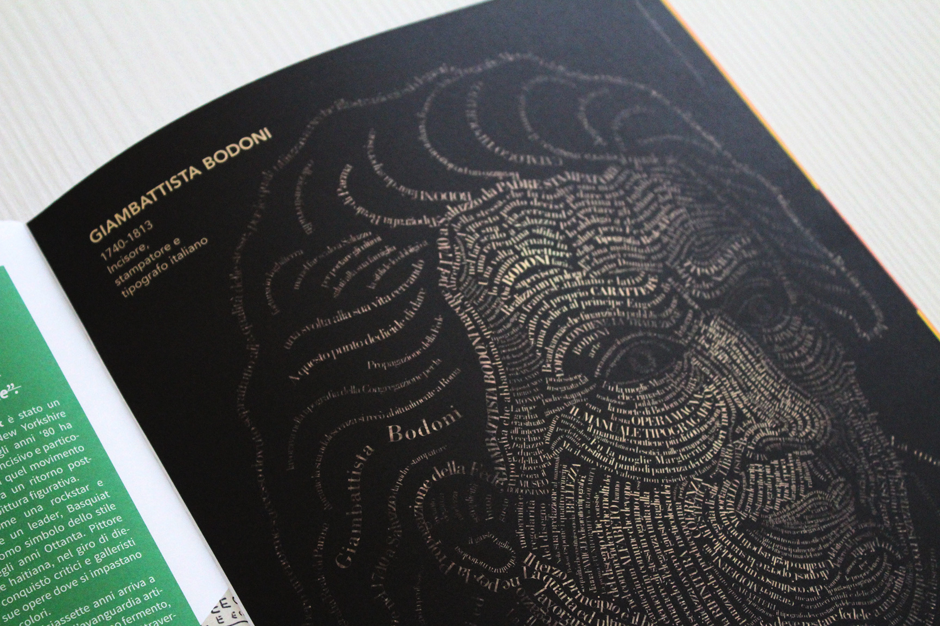
Printed on my design school magazine
Full version for printed A3 Poster: face + torso