Challenge: Create a system to easily practice remote workshop facilitation
Team: 6 members, including 1 facilitator, 3 UX Designers, 1 Product Manager, 1 Marketer
Duration: 4 months (July - October 2020)
Modality: Project done remotely with team members based in the U.S.A., Europe and Middle East.
My role: UX Designer and Facebook Group manager
My Deliverables: Prototype, Chatbot Conversation Design, Copywriting, Implementation, User Recrutiment, User Interviews, Logo Design
Context
As students of a facilitation online class, we were lacking the practice to become confident at running workshops in person or remotely.
So we created a practice system to regularly train to facilitate workshops with other alumni and have the organization automatized as much as possible in order for it to be sustainable activity for us in the long run.
As one of the UX designers, I designed multiple versions of the prototype, implemented them, did the copywriting, recruited users, did the second round of User Testing Interviews, did their reports, and managed our facilitation community on Facebook.
Premise: we had no budget for this project, only our skills and our time.
The Process: Design Sprint 2.0
We used the Design Sprint, a problem-solving linear process where we work together to get team alignment, design and prototype a solution rapidly to test it with users and iterate.
Design Sprint 2.0 step by step process
In order to define the challenge, we conducted expert interviews to understand the current problems with the community. Based on this, we looked for problem-solving inspiration and created solutions.
We then curated and voted on the best solution and we prepared a user flow and storyboard that helped us design a realistic prototype that solved the problem.
Once the prototype was made, we validated it with users and used their feedback and our observations to iterate and improve the final prototype.
Now let’s dive right into each step of the process.
Defining the Challenge
Research: Expert Interviews
In order to get team alignment on the challenge to tackle, part of the team interviewed the 2 subject matter experts (SME), who at the time were the 2 team members who initially managed the Facebook group we had recently opened to communicate with other alumni, as admins. Therefore, they were the ones with more insights on the dynamics of the community and knew what needed to be tackled first.
Experts’ pain points
The interviews revealed that the main problems were:
The Map
To help us visualize where the problem areas were and where we wanted to focus, we
proceeded to draw the map. It represents an approximation of the journey of our users/actors and how they interact with the Facebook group and their final goal.
proceeded to draw the map. It represents an approximation of the journey of our users/actors and how they interact with the Facebook group and their final goal.
There are 2 types of users/actors:
• Admins (our team)
• Group Members (other alumni)
• Admins (our team)
• Group Members (other alumni)
The journey map is divided into 3 areas:
• Discover: how users discover our group
• Learn: how users learn about the group
• Use: how users actually use our group
• Discover: how users discover our group
• Learn: how users learn about the group
• Use: how users actually use our group
Screenshot of the Map exercise during the Remote Design Sprint workshop on Mural
Focus Area
The Map exercise revealed that for the rest of the Design Sprint, we should focus on building an automated system to simulate a full Design Sprint.
Solutions + Voting for the best one
In order to get our creative juices flowing and generate solutions, we carried out several
exercises, culminating in each one of us designing our final solution proposal: a clear 3-step concept.
exercises, culminating in each one of us designing our final solution proposal: a clear 3-step concept.
The Winning concept
After we revealed our proposals, we voted for a chatbot that would allow us to automatically recruit participants for a workshop and work as an accountability system as well. But for this matter we focused solely on the recruitment part.
Screenshot of all of our sketches on Mural, mine is the first, on the left. The winning concept is the last one, on the right: a chatbot. Click to enlarge.
Creating the Storyboard
Before we prototype the solution, we need to further explore it, by breaking down the main steps the user will go through, from a realistic entry point (they enter our Facebook group) to an ideal ending (they participate in a workshop). We all collaborated in creating the storyboard with the graphic elements we had from the ideation phase.
Storyboard we designed together re-using the visual elements that had been used throughout the workshop.
One of the UX designers proceeded to do an initial rapid prototype to get the idea better, showing an onboarding conversation with the chatbot:
Rapid prototype to get the idea better, showing an onboarding conversation with the chatbot done by one of the other UX Designers.
At this point, we split the group into 3 teams:
• Tech Research: some of us would look for free automation tools to build the chatbot
prototype and then add the copywriting to the chatbot
• User Testing Recruitment: some would recruit for the User Test
• Chatbot Conversation Design/copywriting: this was my task, to design the conversations with the Chatbot.
Prototyping the Chatbot: Conversation Design
After a O.K. from the tech research team, I proceeded to design the Chatbot conversation. This was an exciting moment. We were almost there!
Deciding to design the whole conversation journey
Normally, we would have to design only a few screens in a Design Sprint, get the MVP and test it right away. However, I decided to design Chatbot conversations for multiple scenarios if we wanted to test this prototype at different stages of a workshop, its triggers and the users reactions.
Another decisive factor for me was also to save time: I was having the impression we were losing momentum and the more we waited to launch, the more the community died and the more difficult it would be for it to rerive later. No community meant no practice, which was our end goal.
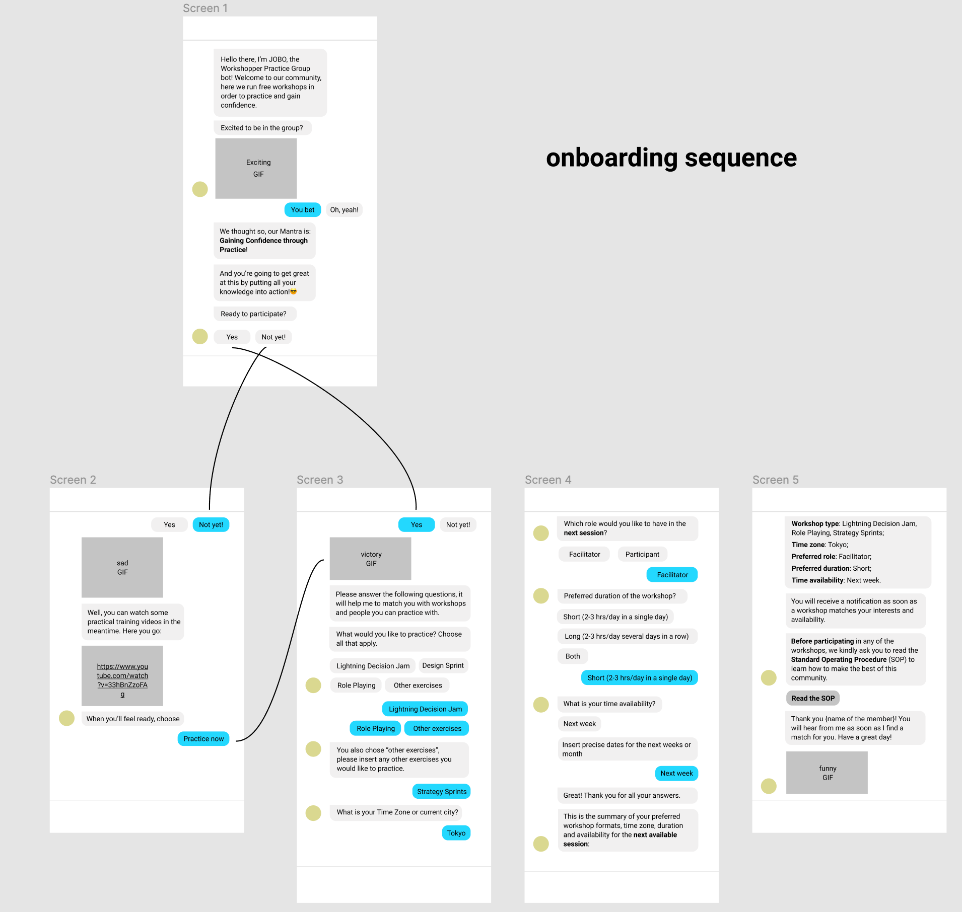
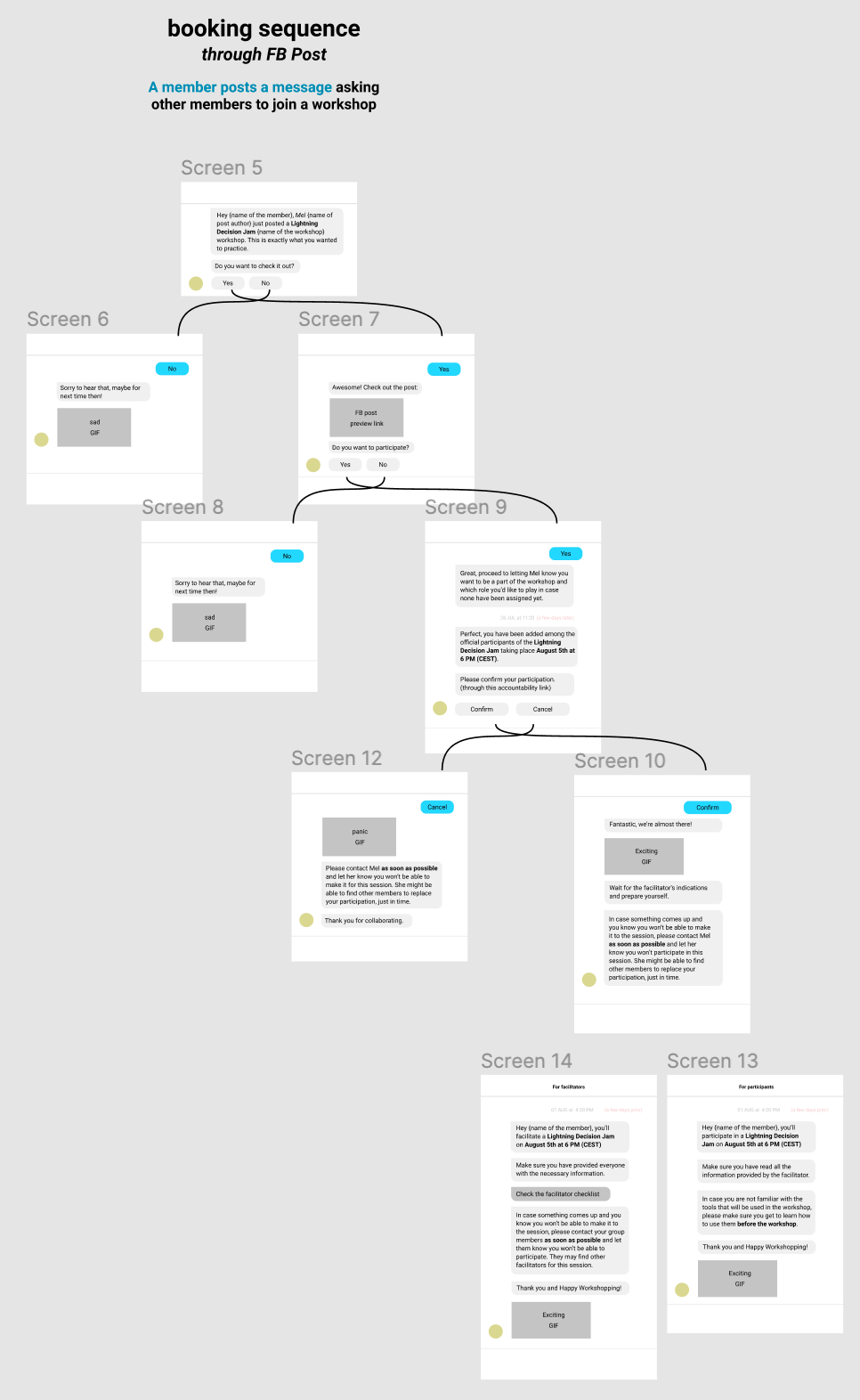
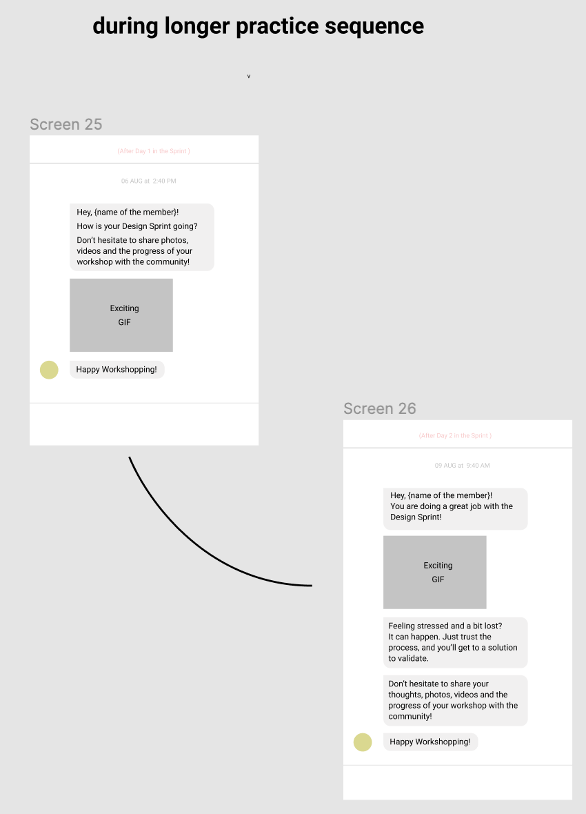
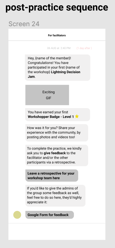
Therefore, I chose to design a Chatbot conversation for the entire journey:
Chatbot conversation journey

Pivot: Abort Chatbot Mission
In the tools research phase, we checked the chatbot functionalities and that it worked with Facebook Messenger, however, perhaps blinded by the excitement, we missed that the free chatbot we intended to use worked only with Facebook Pages, not Facebook Groups.
We had no budget and asking a community to pay for a service that was struggling to launch, did not seem appropriate, at least at the beginning. So we could only afford free tools for now.
In the end, we decided that moving members from a private group to a public page was probably not the right move to make as the lack of confidence in facilitation was one of the main pain points of our community and we needed a safe, private place to practice and share our concerns.
So this could only mean one thing: chatbot mission aborted.
A New Solution: the Survey
Looking back at previous solutions from our ideation session and considering our constraints (no budget, limited time and workforce), the new prototype would take the shape of a survey to retrieve useful data about members for us to be able to manually arrange and organize workshops for members.
Once members were accepted in the group they would:
1. Fill out + submit the survey found linked in a group post
2. Wait for admins to tag them in a post with other members with matching availability
Everthing is not lost
The content requested in the chatbot conversations would be requested here, so the work I had previously done, was somehow a preparation for this one.
Prototyping + testing the Survey
The information requested for the prototype survey regarded 3 areas:
Survey information retrieval
Iterations of the survey prototype
The prototype design went through 2 rounds of iterations, for a total of 3 prototypes:
Here is a brief summary of the iterations:
1st survey prototype:
- users would have to fill out the survey every time they wanted to participate in a workshop
- I wrote the 1st survey prototype on Google form
- two of my teammates recruited and interviewed 4 users
- I proceeded to view the recordings and report on insights
Outcome:
- suggestion to use the scheduling tool When2meet.com + the link list service Linktree.com
- users would only have to fill every once in a while, as their facilitator level changed.
- suggestion to use the scheduling tool When2meet.com + the link list service Linktree.com
- users would only have to fill every once in a while, as their facilitator level changed.
2nd survey prototype:
- Together with one other UX designer, we tried and tested survey/form editor tools that would allow
us to improve our form experience. Once we found a good solution:
- we used Cards, dropdown menus and conditional questions within the form to improve in terms of clarity and focus
- we made sure the form was mobile friendly
- we added look and feel that matched our tone of voice on Facebook
- we integrated the suggested tool additions.
New User Task Flow
User Task Flow: second version. We included 2 new tools that would assist us in organizing workshops: Linktree + When2meet.
Recruiting for User Testing internationally
I recruited members from the community by posting a message in our Facebook group.
4 members responded: 1 from Asia, 1 from the U.S.A. and 2 from Europe.
I proceeded to message them privately over Facebook Messenger, asking:
• For a proper date and time to meet over Zoom
• permission for them to be recorded during the test
• permission for them to share their screen while testing this survey.
I got positive answers for all of them. Had it not been the case for the recording, I would have taken notes instead.
Testing the Survey Prototype
At the beginning of the call, prior to the recording, we had a conversation to warm-up, where we both asked general question to chat.
After 5-7 minutes, I kindly guided them through the process of the test and explained them how it would work. Then, ready, set, action!
I asked them to:
• Share their screen while filling out the survey
• Read out loud and fill out the survey
• Think out loud throughout the entire process
• Share any feedback with us
For privacy reasons, the faces of users have been blurred as well as any recognizing piece of data. I have left my face as I was the interviewer for these 4 user testing sessions.
Me interviewing during one of the user testing session on survey prototype 2. Participant's face was blurred for privacy reasons.
After the User Test, I proceeded to do a report. This time, the main insights regarded our identity and the workshop information:
Final Design of the Survey
After a few more internal iterations, I proceeded to:
• Design our logo for Sprint Rebels to brand our links and tools and give a sense of unity
• Instead of worrying about the length of the survey/form, I focused on the quality of the information explained and requested
• Rebuild the form experience entirely
• Explain every single workshop role
• Gave guidelines to express one’s own level of expertise
• Add questions that might be useful for the workshop, like their professional background
• Ask questions about members progress with the classes we were all students of, as I realized not everyone had finished the course considering the struggles they had understanding the role and workshop questions
• I kept a more conversational and friendly tone like in the Facebook Community.

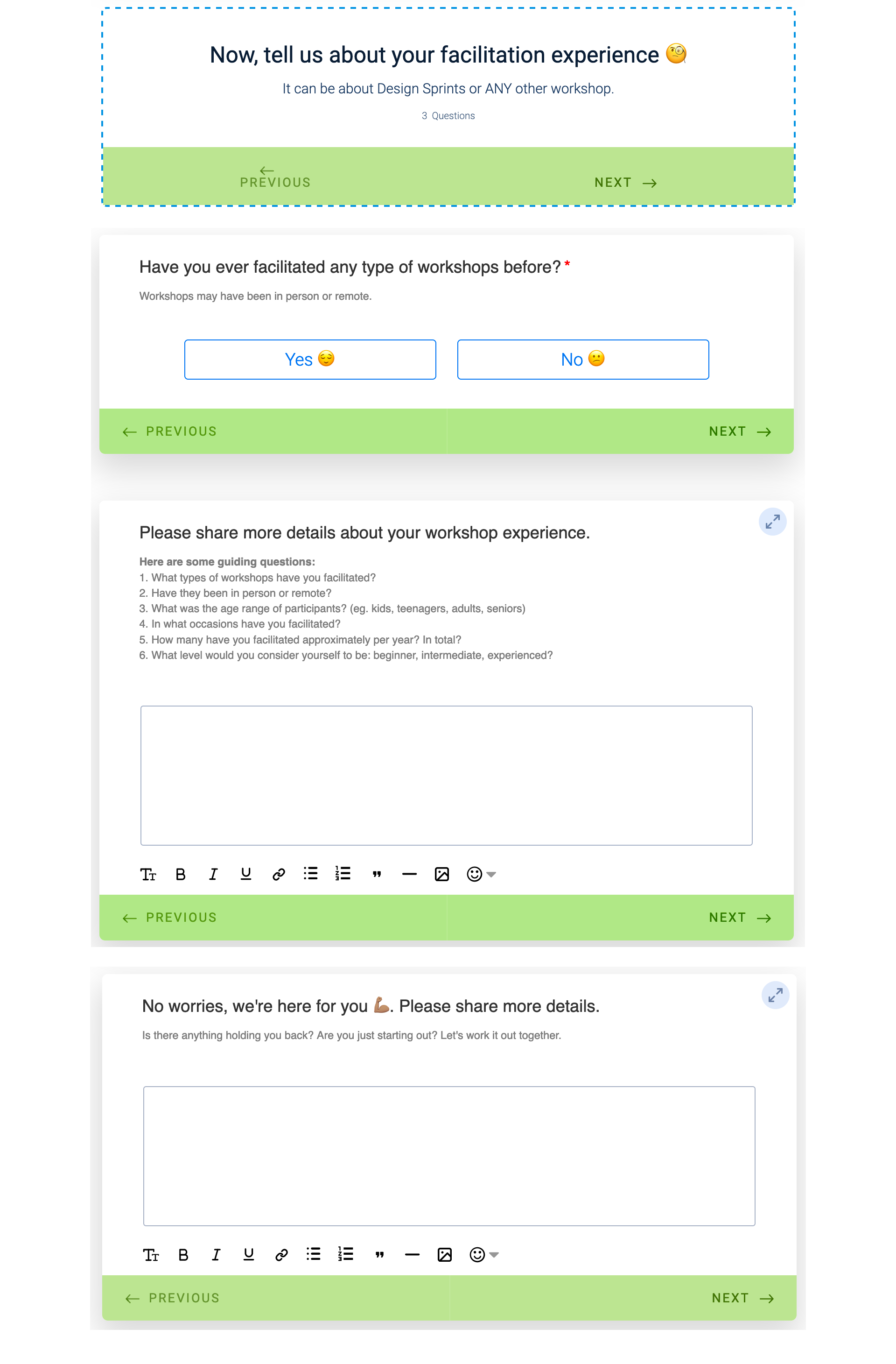
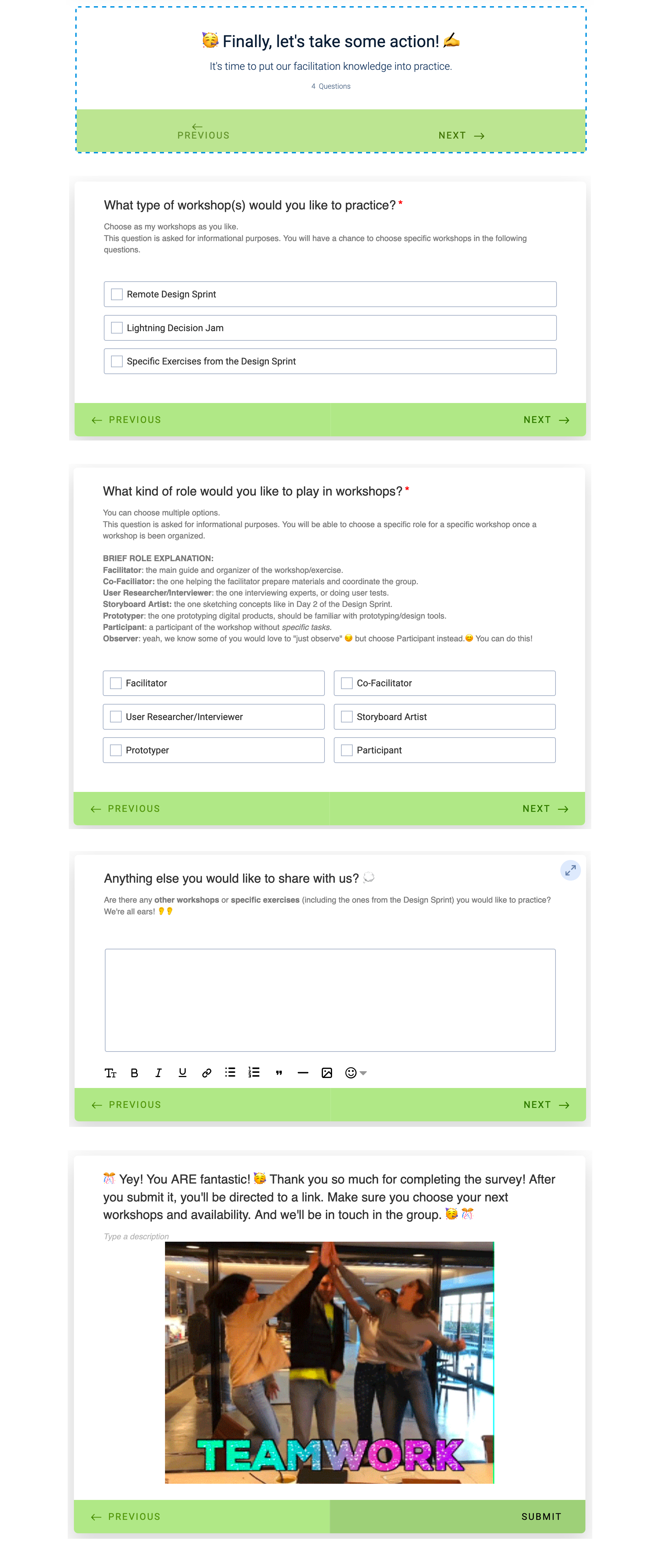
Final prototype of our survey. Click twice to enlarge to full screen. This is the view from the back-office of the form editor to take a screenshot of the full survey. Designed on Jotform. View the live Survey here.
Final full practice system in action
After submitting the survey, users would land on our branded Linktree website, and then proceeded with adding their availability on When2meet.
Full practice system: survey + workshop links + scheduling website
After retrieving data from the survey and When2meet in a spreadsheet, as admins we would publish a post on our Facebook Group tagging all matching members once the minimum number of participants were reached, otherwise the workshop would not flow properly. Then, based on our availability we could help co-facilitating or organizing the workshop.
I also visually designed our practice system in Miro for group members. Here’s the live link.
Conclusion
• Four months into launching and designing the system, 5 workshops were generated thanks to it, others were generated differently (someone posting on the group).
• Out of 281 members, only 17 have filled out the survey so far, meaning there is a conversion rate of 6.1% of the initial part of the system.
• Out of 281 members, only 17 have filled out the survey so far, meaning there is a conversion rate of 6.1% of the initial part of the system.
Chart showing how many filled out the survey: only 6%
In retrospect, I would:
• Ease onboarding process: ask users to add their availability on When2meet first and only ask them to fill out the survey after there was a chance for a workshop to take place;
• Tag participants in posts from the start to join us for workshops and encourage them to follow the system in place
• Create a calendar with networking events, at least once a month to connect and bond with community members + create content
• Recruit new committed moderators to share the workload and be active
• Request donations to reinvest in tools for the community.
Learnings, Personal Takeaways
This project has been a challenging and very rewarding experience for me, both on the front end, while practicing facilitation, and on the back end, while designing the practice system and managing the Facebook group.
At times it was overwhelming because I felt responsible for the 281 members of the
community who entered the group with the intention to practice facilitation and I felt like I had not kept my promise to them. But I did all I possibly could, through trial and error and I keep trying.
At times it was overwhelming because I felt responsible for the 281 members of the
community who entered the group with the intention to practice facilitation and I felt like I had not kept my promise to them. But I did all I possibly could, through trial and error and I keep trying.
Dealing with team members availability was also very challenging as this was a labour of love and we only dedicated our time and skills to this.
All in all, we may not have obtained the expected outcome for the practice system (so far) but I did have the amazing opportunity:
• to design a service and not the more common app or website
• to network a lot and make friends with fantastic people worldwide
• to carry out my first real User Interviews, which was quite fun and exciting. I particularly loved seeing the live reactions of something I had created and the effect it had on people. Testing is indeed of paramount importance.
• to learn different ways of running Design Sprints and other workshops remotely
• to use remote collaboration tools and the dynamics of working remotely with an international team
• to learn about chatbots and conversation design
• to learn to manage a Facebook Group with all its tools.
It has been quite an exciting ride! To be continued…
