Challenge: Improve written smartphone communication for a specific target group
Team: solo project, I carried out all of the tasks myself for this course assignment
Duration: 3 months circa
My role: UX Designer
My deliverables: Survey results, Empathy and Affinity Maps, User Persona, Customer Journey Map, Ideation session results, Wireframes, Low Fidelity, High Fidelity and Interactive Prototypes, Usability Test results.
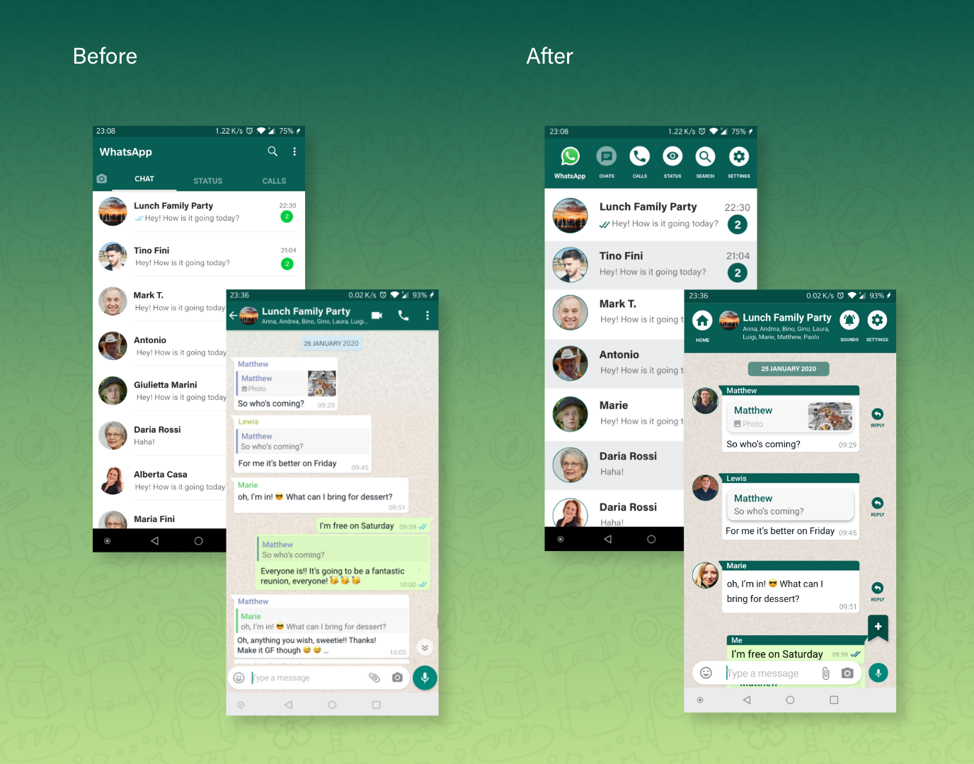
Before and After design of Whatsapp chats
Context
When I was asked to improve written smartphone communication for a specific target group in my UX course assignment, I could not help but think of older members in my social circle and how they frequently struggle with group chats.
This is why I set out to reimagine Whatsapp (for Android) group chats with improved accessibility for users aged 65+.The Process: design thinking
I based my process on the design thinking methodology, a non-linear problem-solving process composed of 5 stages:
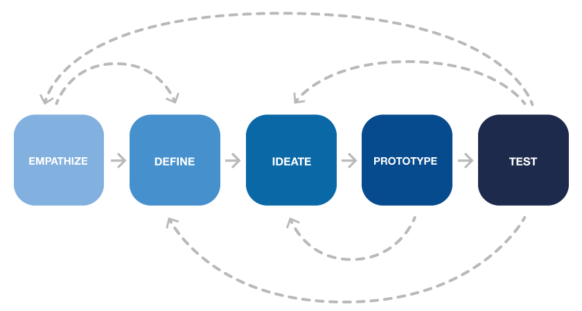
In order to empathize with the users, I conducted quantitative and qualitative research, respectively in the form of surveys and then interviews with observations to learn about how users used messaging apps, their satisfaction level and struggles.
In the define phase, I clustered findings in affinity maps to focus strategically on the specific problems to solve.
While ideating, I generated solutions for improving the user interface. I then proceeded to design low fidelity, high fidelity and interactive prototypes.
I later tested with the target group. Now let’s dive right into each phase.
Empathizing with users
For a while, I have been noticing the increasing difficulty older members of my social circle have with digital devices and their interfaces. Being the go-to person when these issues occur, I thought it would be a great opportunity to improve the messaging app they normally use.
As a target group, I chose the age group that best represented these older users: men and women aged 65+ who use a smartphone regularly.
Quantivative Research: Survey
I started by doing quantitative research to learn more about users’ needs, preferences and habits: what messaging app they used the most, when, how and why they used it. So I sent a short survey via email to 5 users.
Here are the questions and their results:
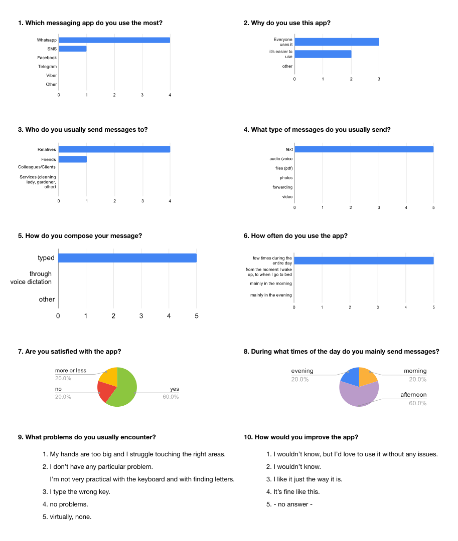
Survey questions + results - click to enlarge
The results revealed that:
• The messaging app most target users use is Whatsapp
• The contacts they interact with the most are mainly relatives
• Users send mainly text messages as opposed to videos/audios/images
• Users encounter problems mainly with the keyboard but don’t use alternatives such as dictation
• Only a 60% of users are satisfied with the app
Qualitative Research: Contextual Interviews
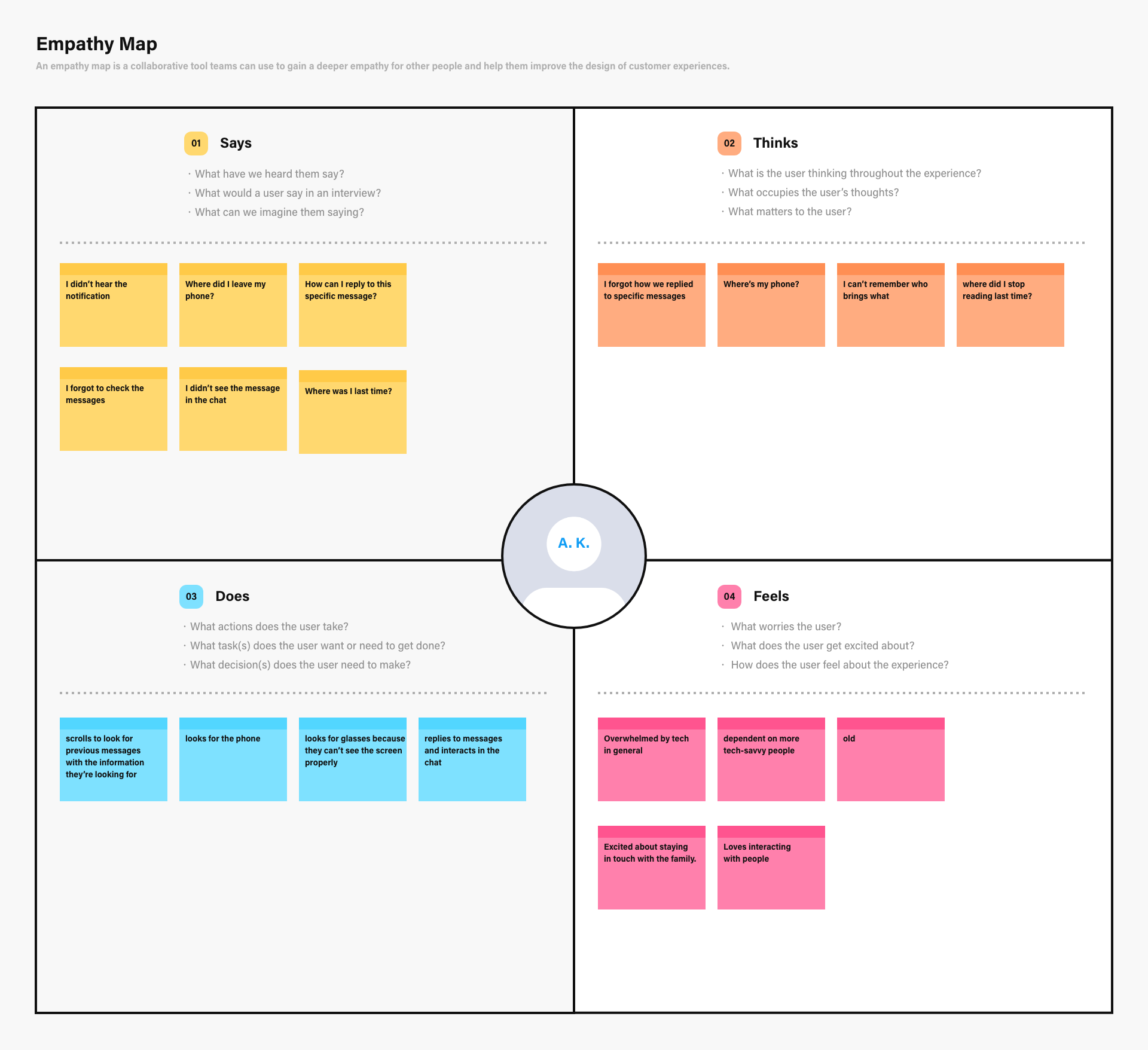
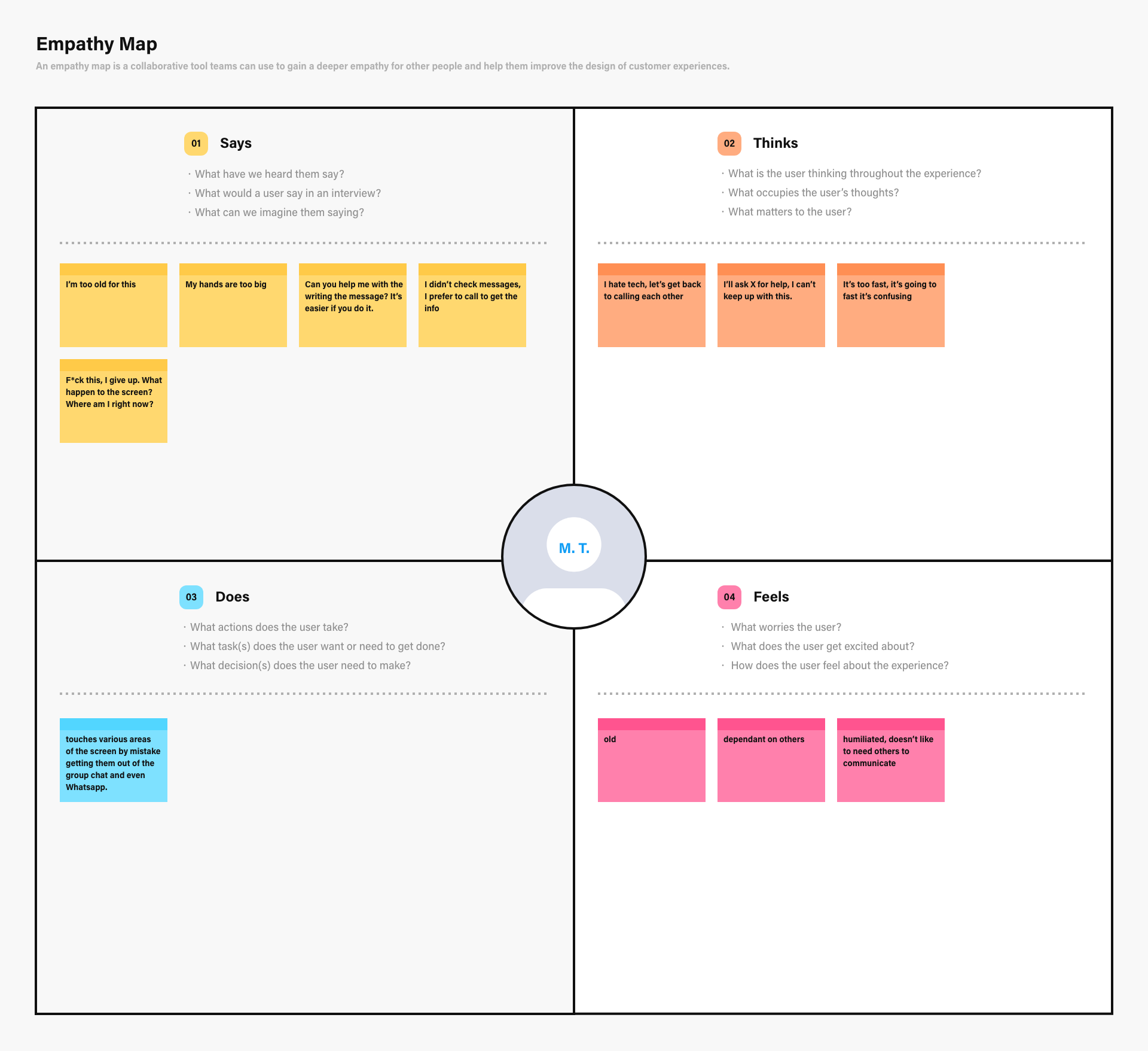
I then proceeded to conduct contextual interviews as part of my qualitative research, to see how they truly interacted with the messaging app. Contextual interviews are a research method that mixes interviews with observations. Due to logistical problems, I conducted these only for 3 out of the 5 users I initially surveyed, as these were the closest members of my social circle and the ones I could have more access to.
This part of research was done in the safe environment of the users’ homes and using their respective smartphones. I was also a member of the group chat they were most active in, so I could also observe what their participation was like in the group chat even when I was not present with them.
For 1 month, I gathered information about 3 categories:
- Words: what users said about the group chat
- Faces: what facial expressions users made while interacting with the group chat or when talked about it and how they felt about it
- Behaviour: what users did and did not in the group chat
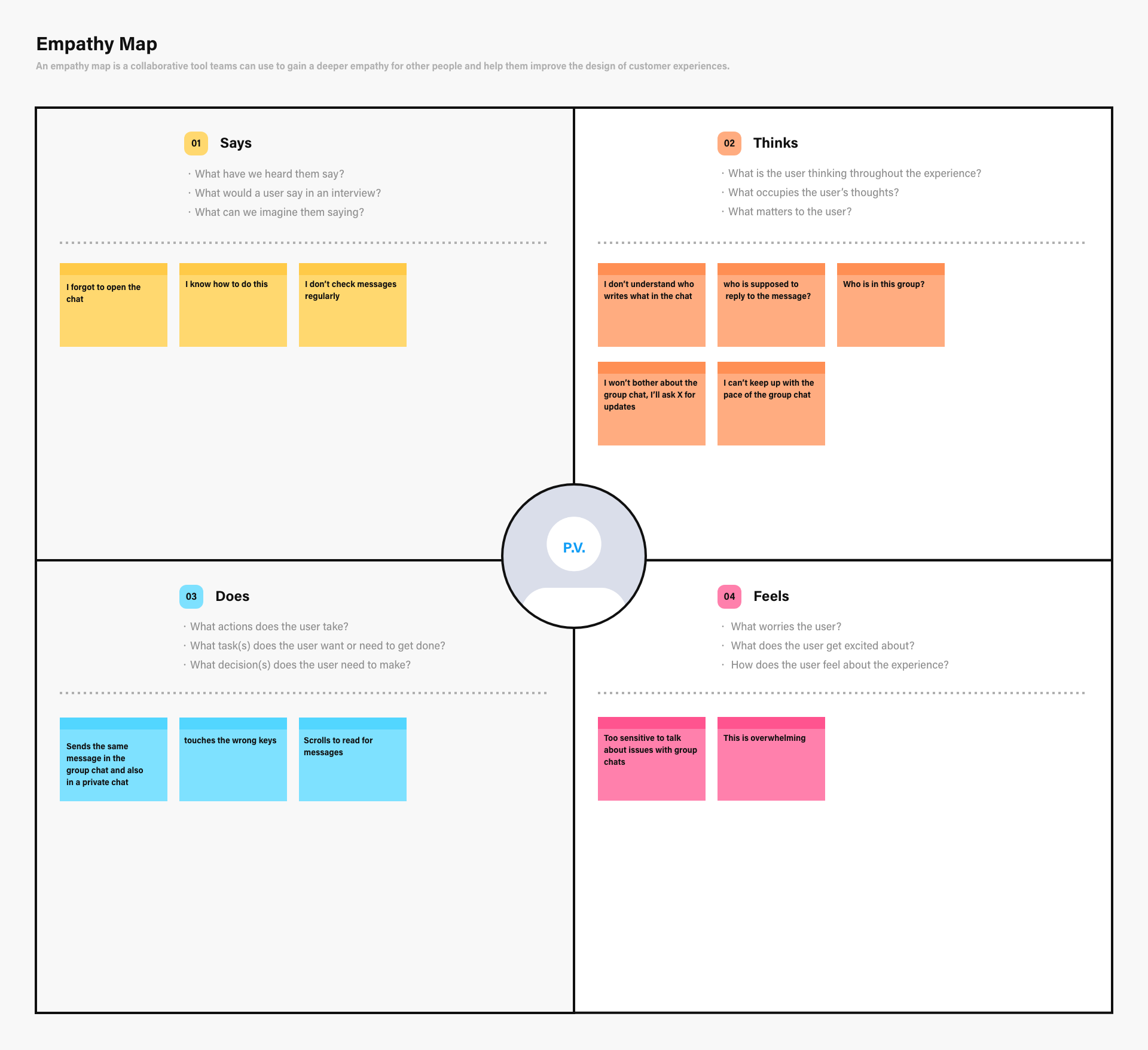
To gather my learnings from contextual interviews, I filled out Empathy Maps for each participant, they are divided into 4 quadrants, gathering what the user Says, Thinks, Does and Feels. Click on the images to enlarge.
Defining users’ needs, problems and my insight
To summarize and make sense of it all, I proceeded to gather all this information and create an Affinity Map. Four main topic areas revealed themselves:
memory, technical knowledge, emotions, and physical/sensory.
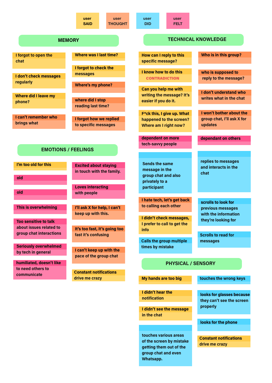
Affinity diagram of Empathy map results - click to enlarge
Users’ struggles
To sum it up, here are users’ main struggles:
Memory issues
- Users easily forget:
• How to do things, especially gestures
• Where they left in the group chat the last time they entered, they don’t necessarily read everything there is to be read at once
- Users proximity to the phone is not a given:
• They lose the phone around their house
• They tend to forget to check the phone
Technical knowledge issues
- Users do not understand group chat dynamics:
• Who sends what?
• Who belongs in the group?
• Who’s supposed to answer a message?
- Users do not always know how to perform tasks
• How to reply to a specific message
Emotions/Feelings
- Users feel
• Overwhelmed
• Excluded
• Old
- Users think it’s their fault if they can’t carry out a task, they’re self-blaming, they feel guilt
Physical/sensory issues
- Large hands for smartphone screen
- Reduced hand mobility
- Slow reactivity
- Low vision
- Users may not notice messages in their chat lists
Being strategic
Analyzing the current situation, I realized that according to Maslow's pyramid, the core users needs that are being affected, pertain to the psychological sphere:
- sense of belonging, community, relationships
- as well as their social status: where they once were entirely autonomous, now they need someone younger educating them on digital interfaces for them to remain relevant in this digital society.
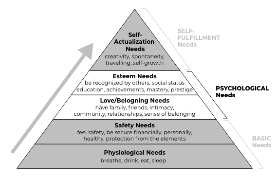
Abraham Maslow's pyramid: the core users needs that are being affected belong to the psychological sphere
If we tackle the issues under Technical Knowledge and Physical/Sensory areas, the Emotional issues (and perhaps Memory issues as well) will be solved as a consequence.
By meeting these psychological needs older users have, not only will we solve part of their problems in digital social interactions, but we will also increase User Retention for Whatsapp messaging app.
Problem statement
The problem statement I will keep as a guide throughout the ideation process will be:
How might we ensure that older users
use Whatsapp successfully so they can
feel included in digital social interactions?
User Persona
With my research insights, I first proceeded to create a User Persona to represent our target users.
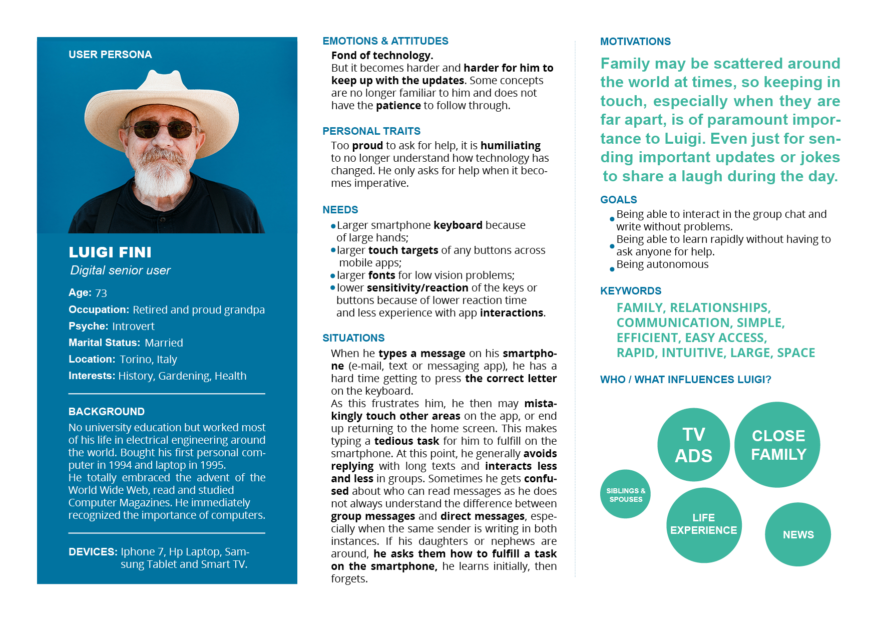
User Persona representing target users. - Click to enlarge
Customer Journey Map
Then I created a Customer Journey Map to describe in detail a typical target user’s experience interacting with a Whatsapp group chat, their progression in the journey and struggles felt along the way. For the journey map I formulated a scenario where a group chat would be certainly most active like having to organize a family lunch.
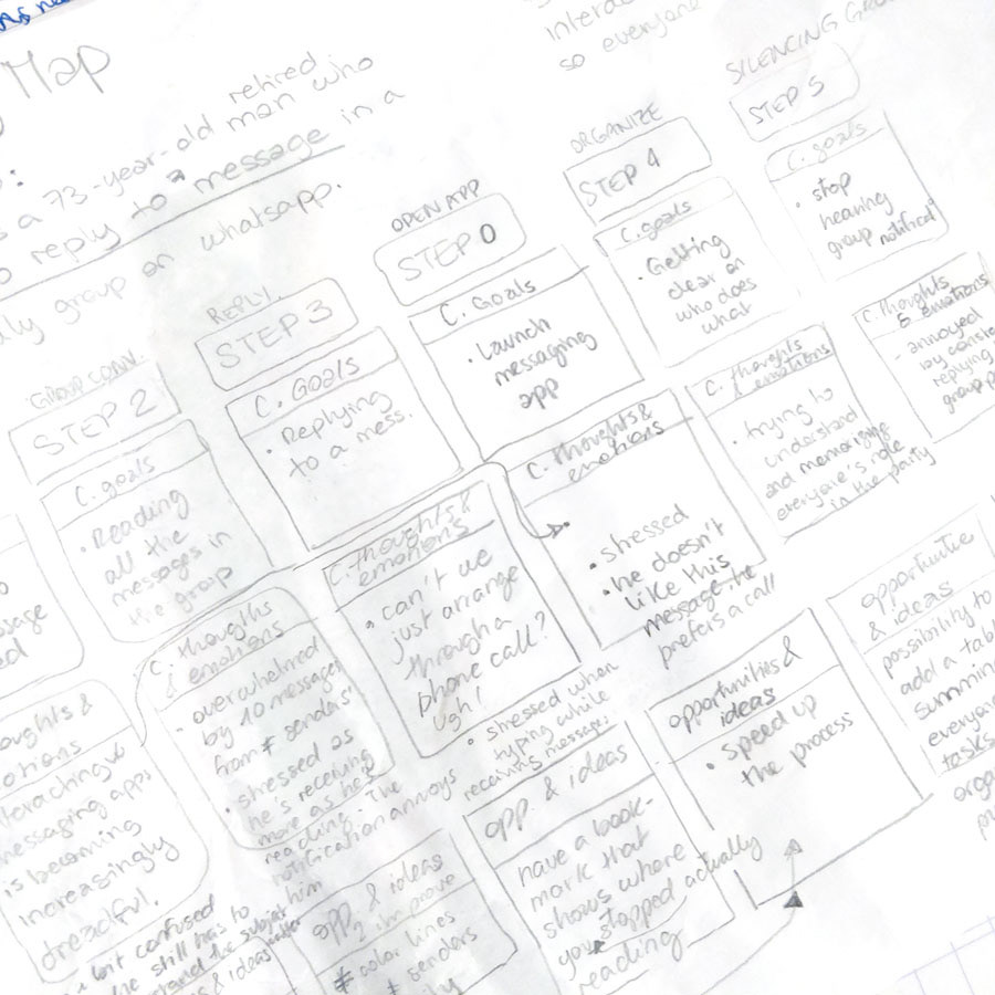
Initial Customer Journey Map sketches
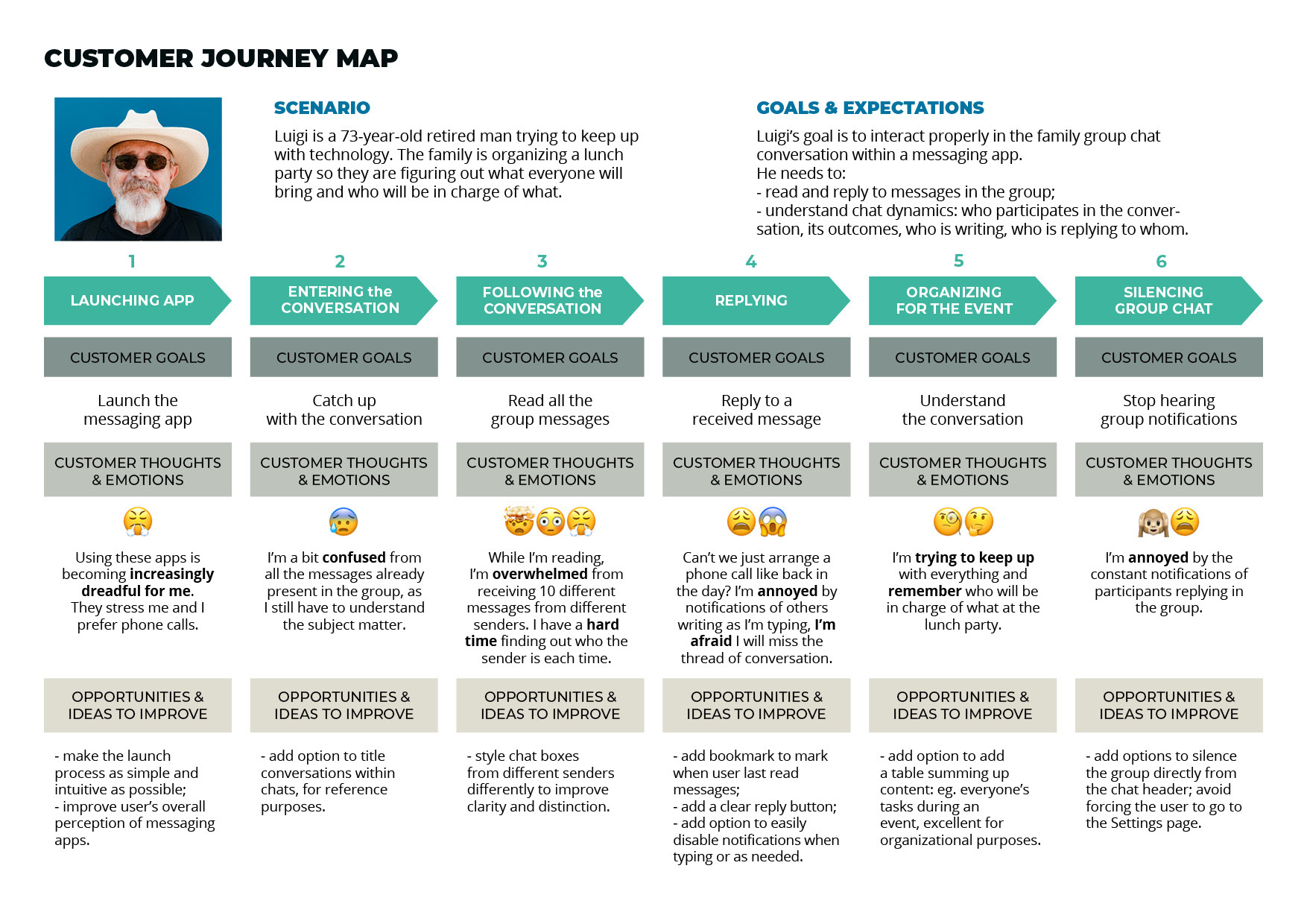
Final Customer Journey Map - click to enlarge
Ideating by challenging assumptions
Now it is time to design solutions that will enhance the user experience for our target users. For the ideation phase, I used the S.C.A.M.P.E.R. method (the acronym stands for Substitute, Combine, Adapt, Modify, Put to another use, Eliminate and Rearrange) which prompts us to explore innovative solutions by asking 7 main questions. It is meant to challenge assumptions and create interesting solutions for our users’ problems.
I proceeded to generate several questions for each of the 7 steps and their respective answers. I then bolded the solutions I considered most viable in dark blue, both for questions and answers.
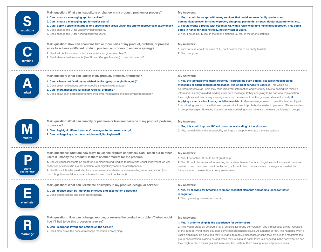
S.C.A.M.P.E.R. ideation method process - click to enlarge
Focusing on Technical and Physical struggles
I then focused on the users’ physical/sensory and technical knowledge issues to work with the questions (and answers) that tackled the concerned issues:
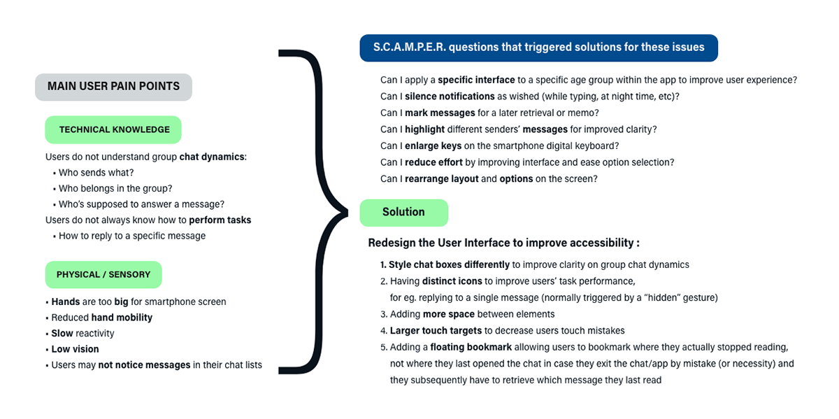
Summary of main user pain points, ideation process and solutions - click to enlarge
I came to the conclusion that most problems could be solved thanks to an improved User Interface for group chats in Whatsapp, but focusing on accessibility.
The user interface redesign would consist of:
1. Styling chat boxes differently to improve clarity on group chat dynamics: chat boxes have the recipients image for improved sender recognition
2. Having distinct icons to improve users’ task performance: for eg. to reply to a single message (normally triggered by a “hidden” gesture) or to silence notifications which are “hidden” under settings
3. Adding space between elements
4. Larger touch targets and rightly spaced to decrease users touch mistakes. As per Google's Material Accessibility Guidelines, in most cases, touch targets that are separated by 8dp of space or more promote balanced information density and usability.
5. Adding a floating bookmark allowing users to bookmark where they actually stopped reading, not where they last opened the chat at, in case they exit the app/chat by mistake, or necessity, and they subsequently have to retrieve which message they last read.
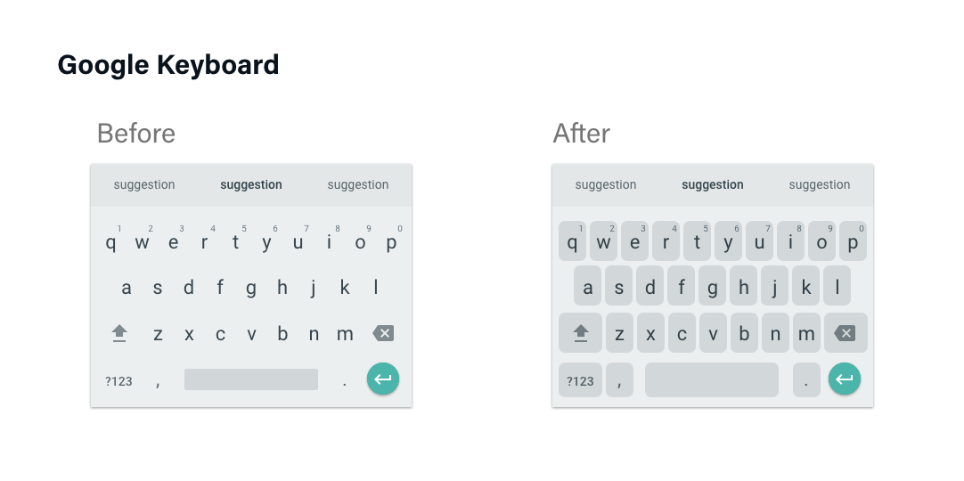
At this point, I also wanted to simplify the writing bar and improve the usability of the keyboard, but I felt I needed to do a whole research project only for this area.
Therefore, for now, I opted to improve the usability of the keyboard by simply choosing an already present keyboard design in the Google Keyboard, located under settings, where letters and symbols had a shape behind them. This gives a sense of the touch target to the user.
Building the prototype
Initial sketches
It all started with some initial drafts. At the beginning I was also exploring ways to add features to the menu in the writing bar that could support group chats to organize events, tasks even in a household. But it would have drifted the focus elsewhere. I focused on essential and currently present features in the app.
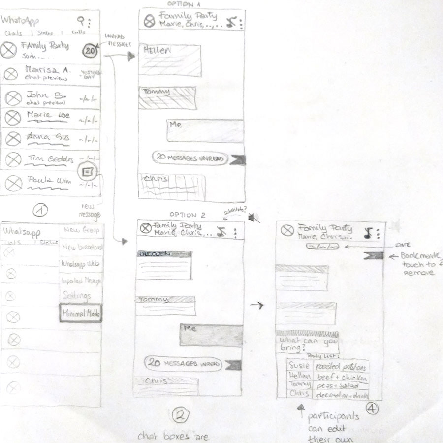
Initial sketches for WhatsApp's group chat redesign
Wireframes
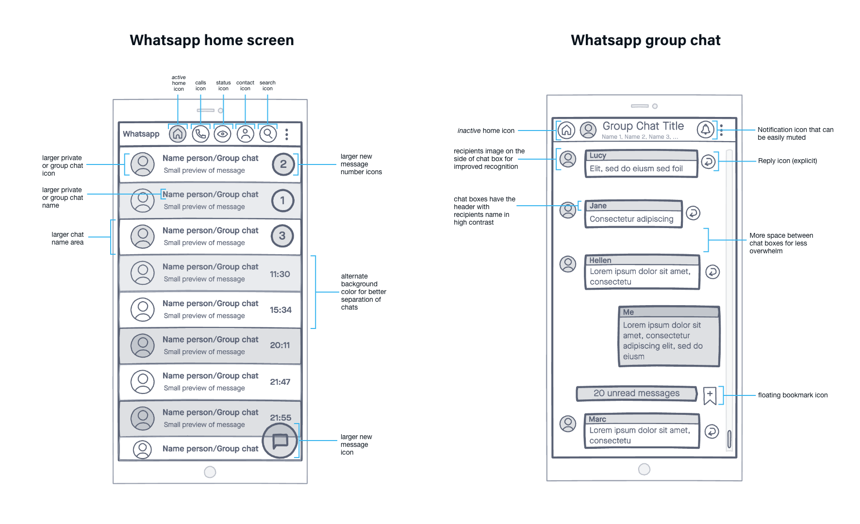
Wireframe of WhatsApp redesign for the home and group chat screens. Done on Invision - click to enlarge
High fidelity Prototype
Using icons on the header:
My intention was to use distinct and clear icons because they are usually more immediate. I also included an explanatory word to increase understanding.
However, I was adding too many icons on the header. I had the impression I was risking to overwhelm users and reduce touch targets around buttons, which are the parts of the screen that respond to user tap.
I had to make a decision: which of these icons could I leave off? I opted to remove the Contacts icon, as this option could be reached from Search icon.
In terms of design, for the options/settings menu I chose the gear icon because it is more self-explanatory than the 3 vertical dots menu and it is more consistent in style with the rest of icons.
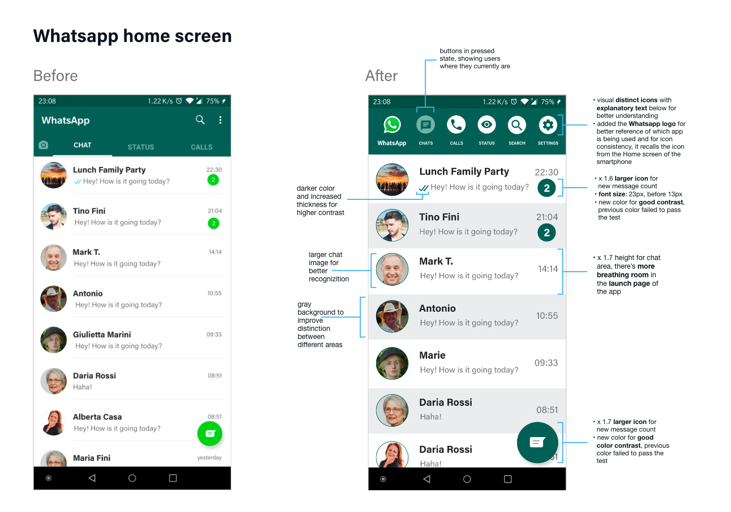
High fidelity prototype of the WhatsApp redesign for older users: before and after for the home screen - click to enlarge
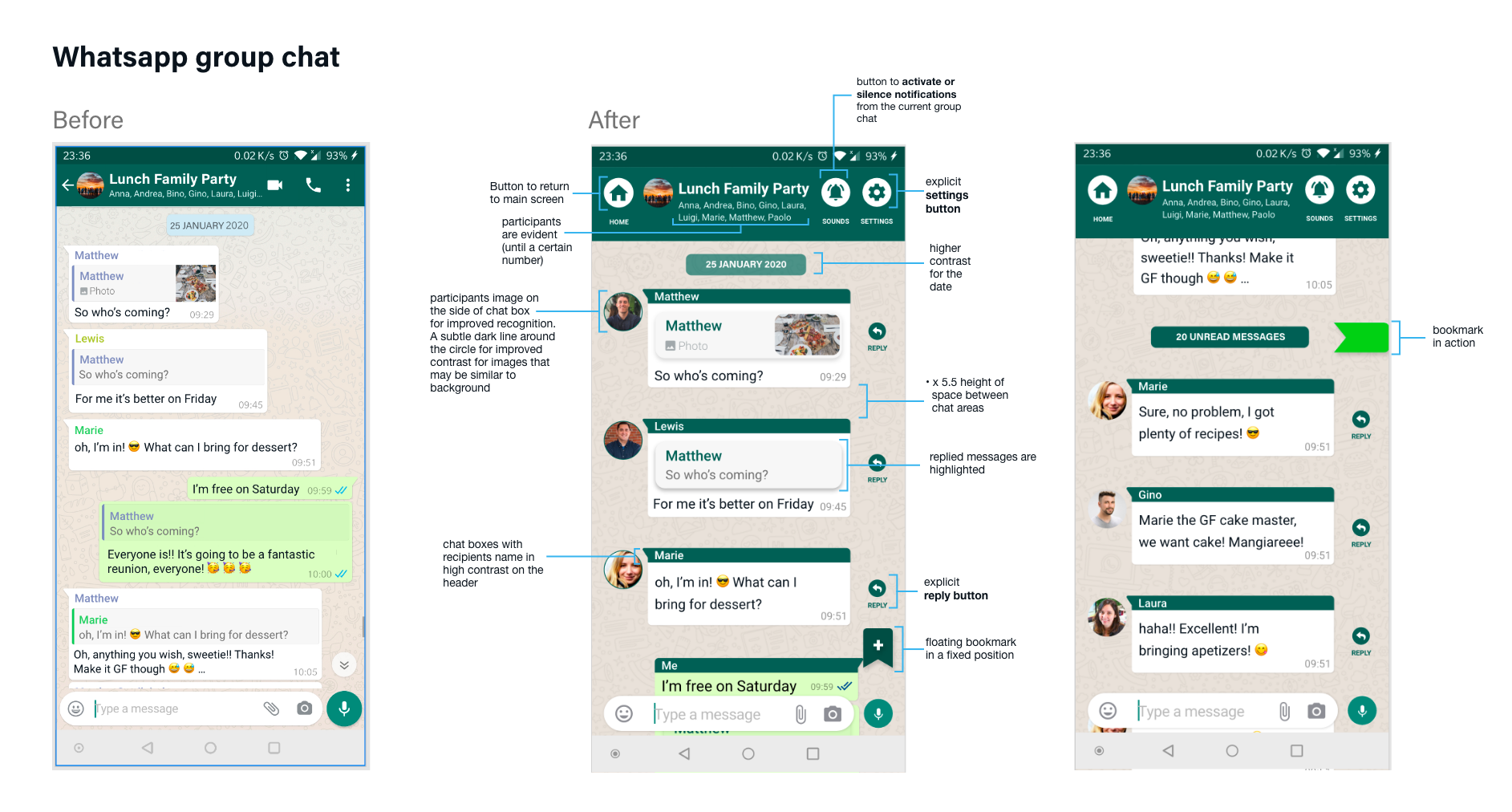
High fidelity prototype of the WhatsApp redesign for older users: before and after for the group chat screens - click to enlarge
Interactive prototype
I created an interactive prototype to test with users on the aspects I focused on solving in order to gain insights on the situation. Having tested them otherwise, for example with a low fidelity prototype would have been pointless as the very accessibility aspects I am trying to improve would not be realistic.
The prototype only covers the tasks that I planned to test on users.
Recorded Animation of the interactive prototype in action
Testing the prototype
For the test I proceeded to handing my Android phone with the interactive prototype ready to be used, to the same 3 users I had done the initial research with in order for them to test the redesign.
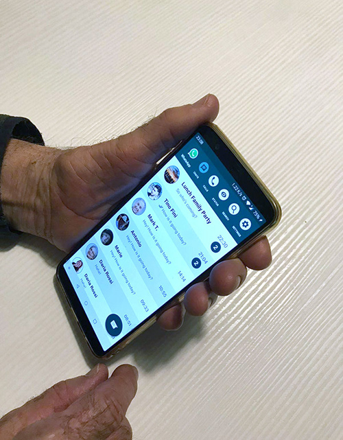
User testing the interactive prototype
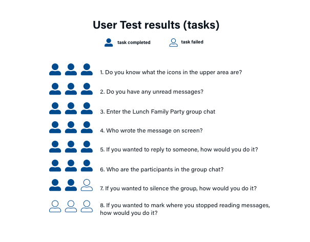
During the test, I asked questions about the overall perception they had about the redesign and then I asked them to fulfill specific tasks. Next to each task are the results:
Test summary
1. Chat boxes redesign: 3 out of 3 users appreciated the redesign, also for the recipients image
2. Distinct icons: 2 out of 3 users improved task performance since they managed to easily reply to a single message and silence a group chat, whereas before they would
3. Space between elements: 3 out of 3 users highly appreciated this, some expressed it also with a “wow, I can read now”.
4. Larger touch targets: 3 out of 3 users did not make any touch mistakes during the test, but this would need further testing for all scenarios to take place and a complete app working prototype.
5. Floating bookmark: 3 out of 3 users did not understand what it was nor its use, the bookmark out of context did not seem to make sense to them
Conclusion
I redesigned Whatsapp for Android to ensure older users (65+) use it successfully and do not get excluded from digital interactions, so my goals were to improve accessibility.
The final test of the prototype revealed that:
1. Chat dynamics knowledge was successful for 100% users
2. Task Performance was successful for 67% of users
3. Physical interaction with touchscreen was successful for 67% of users
4. Message visibility was successful for 100% of users
Problems
The bookmarking feature was a failure. I would further research, with different users, if this feature would be something that would be used and perhaps do an iteration on its rendition.
I also had issues recreating a realistic chat conversation for the prototype, so this should be launched as a beta version and be tested during a longer term to measure user retention and realistic activity over a period of time, not just for a single user test.
I did not analyse the business model or what these visual improvements could mean in terms of costs for the business (WhatsApp).
Learnings, Personal Takeaways
The users with whom I carried out the research phase were much more familiar with e-mails, that’s why I sent the survey via email. However, the rest of the users belonging to this target group may not be familiar with it, so doing in person interviews would have been better.
I would have certainly interviewed and tested with more users and all strangers, not members from my social circle, in order to avoid any biases. However, on a positive note I think I was lucky to be able to research and test the redesign with a close circle because I gained insights from users’ everyday life without them realizing I was observing them and their actions. I would hardly have had such close access to strangers otherwise.
I am currently studying more about accessibility, I would have done a more in depth research about all accessibility issues that a messaging app may have for various disability types and somehow propose specific solutions to solve different issues.
I learned about conducting contextual interviews, I usually observe people a lot but this gave more structure in doing so.